Hi.
Welcome to my portfolio. I document my work in product design and user experience here. Hope you have a nice stay!

Welcome to my portfolio. I document my work in product design and user experience here. Hope you have a nice stay!
My role
I led Product Design for SoFi Student Loan Refinancing for over a year. I collaborated with a Researcher, Content Strategist, Core Team Designer and my Product Manager.
Timeline
Total time spent was 1.5 sprints including usability testing.

Research
The biggest hurdle for non-converting SLR shoppers is anxiety about speed or level of effort.
People believe they will save money, but they also want to save time.
They believe that applying to refinance a student loan will take almost as long as refinancing a home loan.
Communicating the actual time required could be a big win for us.
These insights were taken from a qualitative user research study to generate product ideas based on potential users’ unmet needs.
Hypothesis
Users have just completed the “basic info” portion of the application flow and are fatigued when they reach product offers, causing users to drop off before completing their application.
By introducing content that provides context to the user to explain what happens next we will improve QS to Submit conversion by 1%.

Strategy
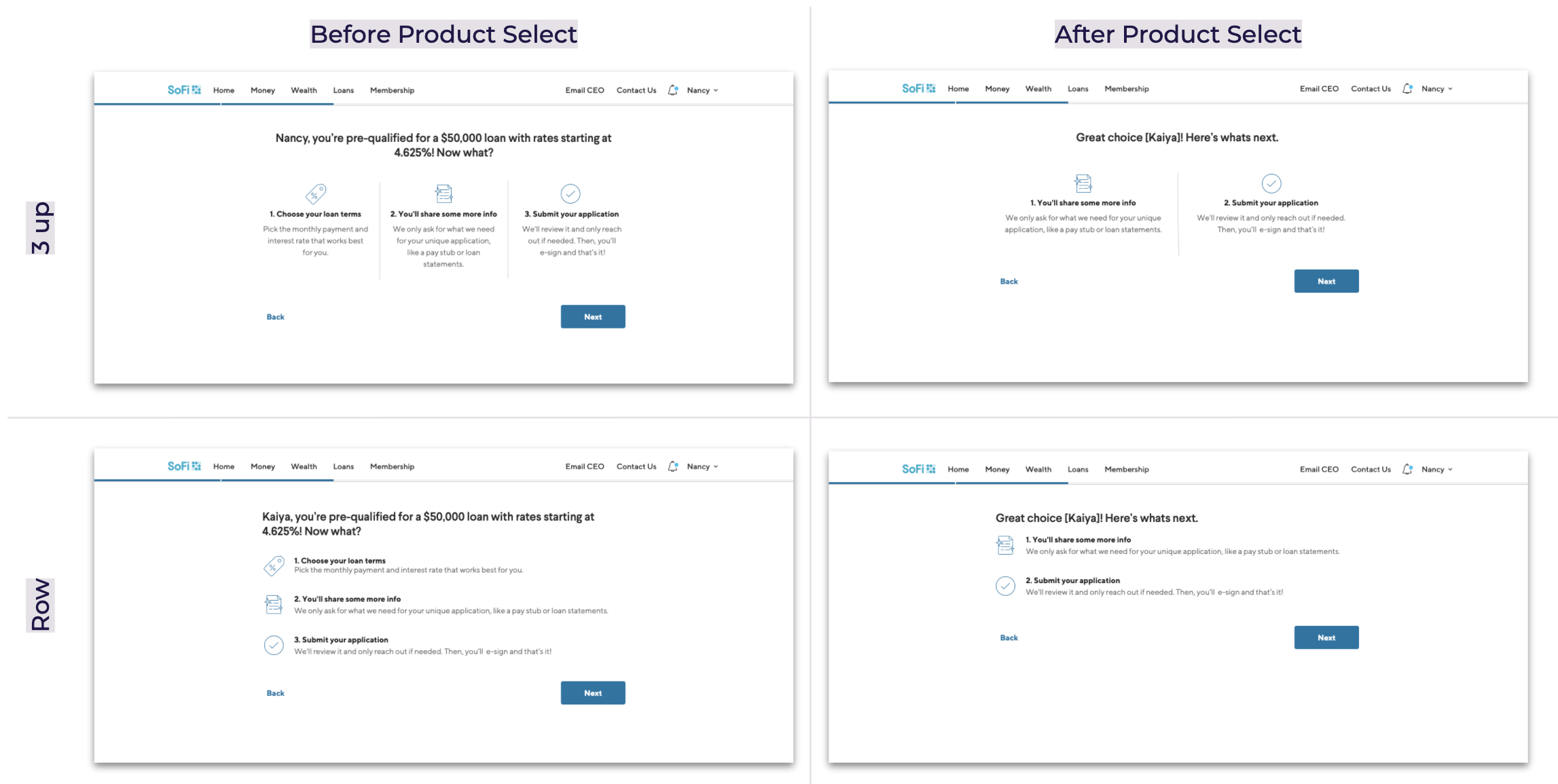
Implementation Options
Visual
Single Page
Modal
Progress Status*
Content
What the user can do right now, with time estimate (Completion)
What’s left for the user to do in the refi process (Completion)
Where the user is at in the overall process (Set Completion)*
Placement
Before product select, after toaster
After product select, before Verification Hub
*Bigger build and out of scope for this experiment
Implementation Decision
Visual
Single Page
Modal
Content
What the user can do right now, with time estimate (Completion)
Placement
Before product select, after toaster
After product select, before Verification Hub


I began by brainstorming with my Content Strategist on the different approaches we could take. It was difficult because we needed to communicate things the user would do, and then things “we” would do. Once we had a few approaches, I dug into our data to determine average time spent in in step so that we could communicate that expectation to the user. However, I hit a snag in that we could not quantify one of the steps due to missing data. I quickly chatted with Legal and determined that we could not estimate this without data to back it, so that datapoint needed to be dropped from the content.
I then circled back withy my Content Strategist and we refined the options and it was time for some team critiques. I presented the strategy and options to my Lending Design team peers, Core Design team, cross functional teammates (Product, Engineering, Operations, Business Leads), and design team management. I then worked in content and visual feedback to my designs and launched the first round of usability testing.
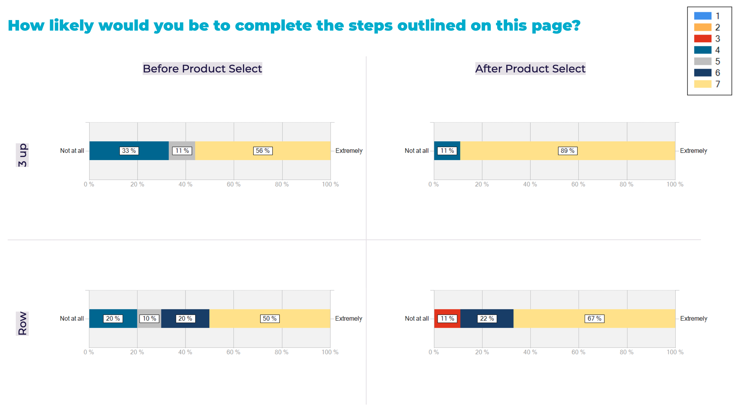
Usability Testing Results Summary
37 users, 4 experiences
“3 up” pattern performed better than “rows”
Visual feedback that the experience was plain and lacked color
Next, test “3 up” pattern with full color illustrations
Additional “3 up” pattern feedback
What was your reaction to this page? How did it make you feel?
“I liked this page. It makes me feel empowered.”
“I liked knowing where I was in the process and what steps I still needed to complete. It was simple, kept me informed, helped me move through the process easily. I like knowing what to expect.”
“I like that it is simple and direct, very easy to follow, I would definitely feel confident completing an application given the steps in such a simple way.”
“I like it, simple and to the point.”
Usability Testing Results Summary
20 users, 2 experiences
No quantitative lift in results
Proceed with planned original “3up” experience and observe results for placement and implementation winner
Unfortunately, all treatment experiences showed a significantly worse performance compared to Control.
However we got a solid user insight: at this moment in our application flow, it’s better to keep users focused on the task at hand than introduce additional information.